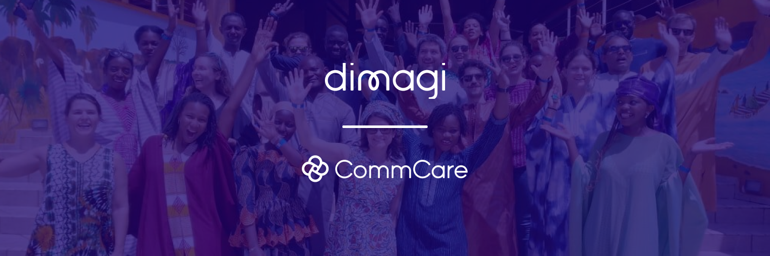
Refreshing our Brands for High-Impact Growth: Introducing New Looks for Dimagi and CommCare
2022 marks Dimagi’s 20th anniversary. This milestone is a chance to reflect and celebrate what we’ve accomplished over the last 20 years as well as refocus on what’s needed to take us forward for the next 20 years of high-impact growth.
As we took a beat to reflect on this milestone, it felt like a natural point for us to re-think not only what we want to do next, but how we want to show up in our work. This year, we worked through a brand refresh for both the Dimagi and CommCare brands, working with Assembly, a woman-owned agency alternative specializing in social enterprises, and with input and consulting from 20+ Dimagi team members. By refining our brands and tying them closely to who we are and what we are trying to do, we intend to create clarity and alignment for our teams, our partners and the Frontline Workers who use our offerings. Moving forward, we are confident our clarified brands will help us in advancing our five-year strategy for high-impact growth and beyond.
Dimagi’s Refreshed Brand
Since our founding, Dimagi has evolved from a group of engineers graduating from MIT looking for ways to improve healthcare service delivery in underserved communities to a thriving and diverse social enterprise supporting frontline work through scalable digital solutions globally. With teams around the world, including large presences in South Africa, India, Senegal and the United States, Dimagi is home to 250+ team members aligned around our vision of creating a world where everyone has access to the services they need to thrive. Now in our 20th year, we find ourselves at an inflection point – a great moment to revisit and rearticulate our brand.
Moving Beyond Health: From Heartbeat to Heart
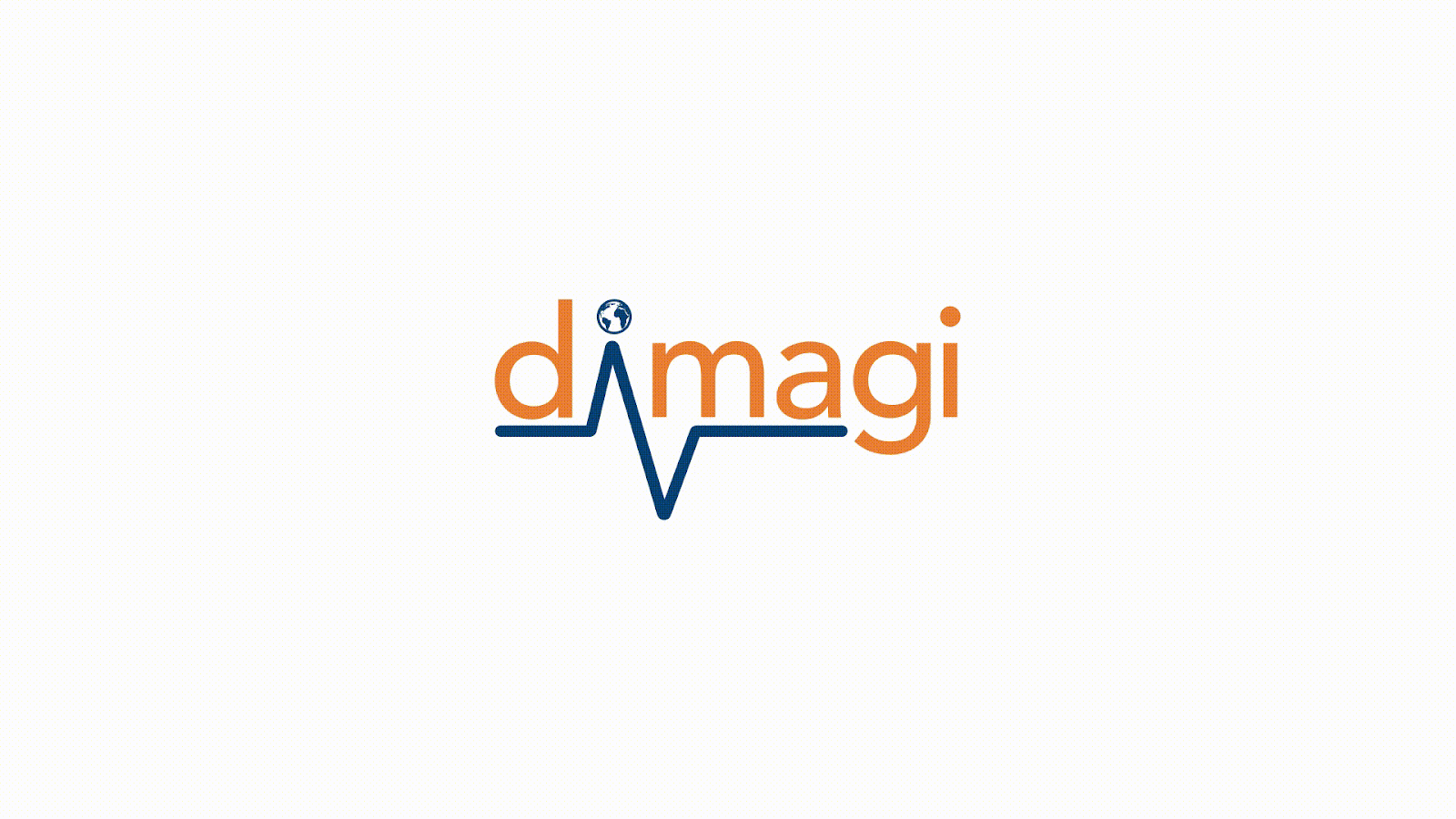
Dimagi’s original logo contains the visual signifier of a heartbeat, based on our focus on the health sector. While we are still heavily involved in creating and scaling technology to improve health service delivery, we are acutely aware of the need for technology to enable all kinds of critical frontline programs and services across sectors – from agriculture and education to financial inclusion and humanitarian response. Resources are scarce and digital solutions need to support the convergence of multiple use cases for the long term while remaining adaptable to changing needs. The heartbeat line has evolved to a new looped M which resembles a heart and speaks to the fact that we are not solely focused on health but support a full range of services necessary for humans to thrive.
A Partner, Not a Vendor
One thing we often hear from our clients is that the reason they love working with our team is because they see us as a true partner. This is core to our approach: We are not just another technology vendor. We have a point of view and are using our business to advocate for a more effective and impactful path forward for global development. Within the new logo, the looped M underscores our connective role in the global health and development industry as a partner, not a vendor. Meanwhile the rounded edges are distinctly human and warm, speaking to the reality that even though we are technologists we are powered by passionate and caring people.
20 Years of Brand History
In our early start-up days, we entered the global health and development stage with an ambitious mission (compared to our small team) to drive impact wherever, and however we could through our digital solutions. The previous Dimagi logo captured the enthusiasm of those early days with a vibrant orange. We remain optimistic about the potential of technology to create change, but we now have 20 years of experience and confidence from running thousands of projects all around the world together with our partners. Our updated color palette, in particular the deep purple indicates the maturity and confidence we’ve earned. It’s also unique as a brand color in the global digital tech space, compared to our partners’ logos.
Truly Global: Continuing to Prioritize LMICs while Expanding Beyond Them
In the early days at Dimagi, we worked in India and parts of Africa. Over time, we scaled to work in dozens of low and middle income countries. In 2020, we entered the US market and saw CommCare used in 130+ countries. Our more modern look and feel is designed to better support our global reach, while staying rooted in on-the-ground understandings of our markets and the applications of our offerings.

CommCare’s Refreshed Brand
With over 1 million users having used CommCare all time, our hero offering’s brand is far more widespread than the Dimagi brand. The journey to create CommCare started in 2008 and is quite unusual for a software product: it’s a story of tenacity, humility and continuous learning first and foremost from our users. (Hear the full story on our podcast).
Over the years, CommCare has matured and evolved. CommCare has entered new markets, added significant new functionality, and served new use cases. At the same time, we’ve continued to prove its effectiveness through our growing evidence base. CommCare remains the most inclusive and accessible platform for data collection and service delivery, working both offline and for low-literacy users in many languages; and it’s become increasingly scalable and robust, meeting rigorous security standards. But our look and feel has not changed, until today.
We believe CommCare’s updated look will give us a strong foundation for CommCare’s growth as the platform for impactful frontline work, everywhere.
Re-committing to Frontline Workers
Over the last 20 years we have maintained our focus on the Frontline Worker, however we have recently re-established this focus with our commitment to Improve Jobs to Improve Outcomes within our 5 Year Strategy. With Frontline Workers as our focus, we design, deploy and support our solutions in a way that amplifies their impact, never weighing them down. Our original logo represents health workers coming together. Building on that logo, the evolved and simplified pinwheel shape in the refreshed logo continues to symbolize the ways that Frontline Workers come together to support the health and thriving of their communities.
Evolving the Existing Logo
With a large user base and strong brand recognition, it was important that the updated CommCare logo was an iteration of the current logo, rather than a full reinvention. The new shade of blue also builds on the brand recognition of our original color palette with a fresh and distinct take. Our updated logo will ensure we maintain the trust and confidence we have developed with our incredible users.
Designing for Mobile App Users First
CommCare’s users are first and foremost Frontline Workers around the world – community health workers, enumerators, clinic staff and supervisors, agricultural extension workers, contact tracers, case investigators, humanitarian workers, home visitors, and more. They use CommCare both on the web and mobile phones, but the majority are mobile users. As such, the new look had to work well on a mobile app. It had to be bold, graphical and unique. It needed to be recognizable from a distance and scaled down. Our evolved pinwheel shape is easy to recognize on any screen.
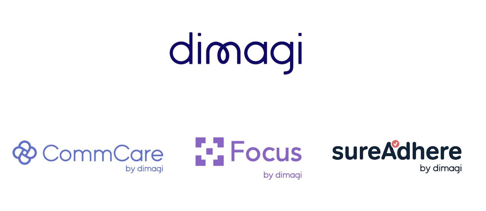
Creating a Brand Architecture to Support a Growing Dimagi Portfolio
To fulfill Dimagi’s mission of building and scaling sustainable, high-impact digital solutions that amplify frontline work, we have broadened our portfolio of offerings beyond CommCare. This refresh clearly articulates the Dimagi brand as our parent brand, allowing space for CommCare, FocusMDM (our mobile device management platform for frontline workforces) and SureAdhere (our virtual care platform for video directly observed therapy) as well as future new offerings to come.
Closing with a big thank you to our partners, employees, alumni, funders and collaborators for all that you’ve done to help us get here. It is your contributions, expertise and support that have made our impact on frontline work possible. And it is by continuing to work together with boldness, humility, and empathy that we’ll be able to continue to scale our impact.
If you are currently using CommCare you won’t be seeing UI changes just yet as we’ll be communicating directly on planned updates soon.
Stay in the loop on the latest at Dimagi by joining our monthly newsletter. And if you are interested in helping take Dimagi and CommCare forward, take a look at our open roles.
Share
Tags
Similar Articles
Dimagi to Exhibit and Host Advanced CommCare Training at ICT4D Conference 2024
Join Dimagi at ICT4D Conference 2024. Sign up for Advanced CommCare Training & engage in impactful discussions on digital development.
Staff Blog
February 22, 2024
CommCare Research Grant Awardee One Year Checkin: Move Up Global | Winner
Celebrate the one-year anniversary of the CommCare Grant for Frontline Research with insights from Move Up Global, the first-place winner, whose study in rural Rwanda focuses on non-biomedical parameters of neglected tropical diseases (NTDs) and malnutrition among school-aged children to improve diagnosis, management, and case surveillance through community health workers and schools.
Staff Blog
February 21, 2024
Design Thinking: Unleasing the Power of Empathy
Being mindful and aware of deep insights Applying creative thinking, discovering new sights Exploring the boundaries of realm of art With innovation and design, to create something from start Design thinking, this creative mission We open our minds, for a whole new vision Fostering our skills, to a wiser design Solving problems, more easily to
Staff Blog
January 25, 2024